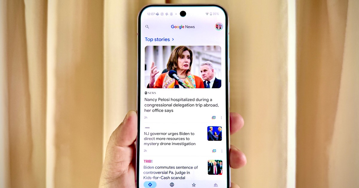
Your Google News app is getting a subtle redesign. Here’s what’s changing
Android, Google, Google News, Mobile, NewsGoogle continues to fine-tune its native apps on Android, this time with Google News. This follows the big redesign to Google Maps that happened earlier this year. So what’s new in Google News?
Basically, the newly redesigned Google News makes things simpler in terms of the bottom bar. Previously, there were four sections in that bottom navigation bar: For you, Headlines, Following, and Newsstand. The revamped version now combines For you and Headlines into a new Home tab, which acts as the default feed for content. The other two tabs — Following and Newsstand — still remain.
There is also a new categories carousel along the top of the app, where you can access: Headlines, Local, U.S., World, Business, Technology, Entertainment, Sports, Science, and Health. All of these categories were previously found in the Headlines section. This change eliminates unnecessary steps and streamlines your content feed.
When you view the category carousel, the selected feed will no longer show an underline. Instead, it basically highlights the category to make it easier to see which feed you’re in. One-handed reachability is not affected by this, but navigation is simplified with the change.
Please enable Javascript to view this content
Consolidating the Google News bottom bar from four to three tabs is not a new decision from Google, as it also made this change to Google Photos and Google Maps. Not only does reducing the number of tabs in the bottom bars make things simpler but it also looks better due to the minimalism, and feels more elegant for Material You.
The Google News redesign is rolling out with version 5.120.x on Android through a server-side update. For iOS Google News users, the new look is not yet live, but should be coming. Unfortunately, though, if you like dynamic color theming on Android, that feature won’t be used in the Google News redesign since it continues to use the blue accent color.
